Today, I’ve got a special treat for you, something most companies won’t share: a peek at one of our losses.

A “best practice” that failed so hard we had to pause part of the test early. And, if I can wax clickbait-y for a moment, it’s a tactic you may be using in your calls-to-action as we speak.
So come for the trainwreck, but stick around for the lesson, because what we learned led to 4% more leads from our CTAs.

And I’m going to show you how to recreate it. (The improvement, that is. Not the trainwreck.)
The Best Practice That Wasn’t
I turn to AJ Beltis, principal marketing manager of conversion strategy, when I need absolute authority on two things: 1) pop-culture movie references, and 2) content conversion.
So when I read an internal brief where a supposed best practice caused a 14% loss in conversion rate, I ran to him like Luke flying back to Obi-Wan.

It all started with a test of the wording on our CTA buttons. Long-time readers may remember that our anchor texts were once a grab-bag of different styles.
“It was up to the bloggers’ discretion because each of those CTAs was individually placed,” AJ explains. “So sometimes it was ‘Get the template,’ sometimes it was ‘Download now.’”
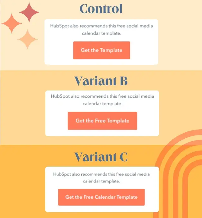
And because we test everything, when we set out to make our CTAs more consistent, we started by testing different language options. The test variants were:
- The Control: “Get the [Product Type]”
Cut and dry. Straight to the point. A great example of our old anchor text strategy.
Example: “Get the Template” - The Best Practice: “Get the Free [Product Type]”
Same as above, only now we add “free” as an enticement. A pretty non-controversial tactic you’ll see in every CTA guide.
Example: “Get the Free Template”
- The Wildcard: “Get the Free [Specific Product]”
Here we add a description of the offer to the button itself. At the time, this felt redundant because there was already a description above the button, but hey, let’s try it.
Example: “Get the Free Social Media Calendar Template”

We were so confident in the results that we put our money where our mouse was and slapped the test on 25 of our highest lead-driving blogs.
“We felt pretty comfortable with the risk because we weren’t removing anything or changing anything drastic,” AJ says. “So it was a reasonably safe way to test something.”
John Hammond felt the same way in Jurassic Park.
What Went Wrong (and What Went Right)
Within two weeks, Variant B cratered our conversion rate by 14%, until we finally paused that branch to mitigate losses to our heavy-hitting lead generators.
So, why didn’t the best practice work?
“One theory is that whenever you see something labeled as ‘free’ on the internet, it might have a spammy connotation.”
In other words, like Pavlov’s dogs, we’ve all been trained to see “Free Download” and immediately scroll past what is surely a scam and/or an ED cure.
Ah, but what about Variant C? The one we dismissed as redundant?
That one actually boosted our conversion rate by 4% overall, and by 7% among new visitors.
So, why did this variant work where the other failed?
AJ believes it’s all about using visual cues to highlight keywords the reader is looking for.
“When people are reading a blog post, they’re often just kind of skimming as quickly as possible to get an answer,” he says with a shrug and a sideways smile. “I’ve been a blogger and it sucks to say, but no one is typically reading all 1,200 words that you put your time and effort into.”
(But not you, dear reader. Not you … Right?)
Say a visitor is skimming to learn about social media content calendars. Suddenly they see a big orange button that offers a social media content calendar template.
“This is the specific thing that I want and it’s free? I’ll get it.”

The Takeaways About CTAs
To see the biggest takeaway, scroll back up and check out the CTA button right beneath the title of this very blog. You’ll see that we no longer include descriptive text above the button, and instead use the description on the button itself.
Some of AJ’s other insights:
1. Test Every-freaking-thing. (Or “Don’t take best practices at face value.”)
Trusting best practice alone would have damaged our conversion rate, and we might have never known why.
Similarly, if we hadn’t tested what we assumed was the redundant option, we would never have found a win.
“If we had just tested ‘free’ versus the control, the test wouldn’t have worked,” AJ points out. “But because we tested ‘free’ versus the control versus ‘free [specific thing]’, that extra layer worked.”
2. Use Keywords in Your Anchor Text
“If you can use those buzzwords they’re looking for, that’s going to be more successful. Using the words ‘content calendar template’ or ‘planning template’ when they’re reading a blog about social media content calendars … they’re already thinking about that word, so psychologically, it might hook them a little faster.”
Placing keywords in your anchor text is also a win for accessibility, as it helps folks who use screen readers to know what they’re clicking on.
3. DO Test on Your Biggest Lead Drivers
After getting beat worse than Rocky by Apollo, you might think we switched to testing on less important pages, but that’s not the case.
As Rocky says: “It ain‘t about how hard you’re hit, it’s about how you can get hit and keep moving forward.”
As AJ says: “When we look at testing our top pages, that’s also where the biggest opportunity for growth is. If we were to be a little safer by testing pages that don’t convert as well, we might not have been able to detect the magnitude of how successful or unsuccessful a tactic might be.”

4. Trust your audience above authority.
And that includes me, AJ, and Obi-Wan.
Always trust your audience’s reaction over what you find in any guide.
“Respond to your audience,” AJ says. “Some audiences might find a test that we ran to not be a good match. Whereas, we might look for inspiration from other companies, run it on the HubSpot blog audience, and find that their test doesn’t work for us.”
5. Test your offers, too.
Amid all this talk about CTAs, AJ drives one final point home: Your CTA is only as good as what it’s offering.
So test what you’re offering, too.
“We use templates because templates work for us. We don’t do webinars because webinars don’t work for us. Some companies, all they do is webinars, because that’s what works for their content sphere.”
How to Test Your CTA Button Text and Offers
Unlike in Rebecca’s test of paid ad landing pages, for this one you do want to test one element at a time. So be sure to test your anchor text and content offers separately.
You’ll also want to use a tool that evenly splits your traffic across the variants—something like Convert, VWO, or, hey, Content Hub!
- Navigate to the test page.
- Click on the file menu and then choose “New,” then “Run A/B Test.”
- Enter a name for each variation.
This should be something descriptive that will be easy to remember. If you look at the first screenshot, you’ll see we simply used “Original Page,” “Variant B – Free,” and “Variant C – Free + Description.”
- Click “Create variation.”
- Edit the anchor text or the destination of the link (but not both!)
For this time of optimization, you’ll get better results by testing one change at a time. (Though you can certainly test multiple variations on that one change.)
To recreate AJ’s test, try out a description of the offer within the anchor text. Heck, you may even want to try using “free.”
- Click “Publish” in the upper right corner, then “Publish now.”
No matter what you decide to test, be sure to keep an eye on the results over time. Be ready to pull that emergency brake so you can avoid your own trainwreck.


![How Cutting Distribution Boosted Our YouTube Views by 420% [Expert Interview] how-cutting-distribution-boosted-our-youtube-views-by-420%-[expert-interview]](https://blog.contentkrush.com/wp-content/uploads/2024/09/140269-how-cutting-distribution-boosted-our-youtube-views-by-420-expert-interview-510x348.webp)
![The Tiny Layout Tweak That Led to 20% More Conversions [Test Results] the-tiny-layout-tweak-that-led-to-20%-more-conversions-[test-results]](https://blog.contentkrush.com/wp-content/uploads/2024/12/140615-the-tiny-layout-tweak-that-led-to-20-more-conversions-test-results-510x369.webp)

![What We Didn’t Do Boosted Our Paid Ad CVR by 11% [Expert Interview] what-we-didn’t-do-boosted-our-paid-ad-cvr-by-11%-[expert-interview]](https://blog.contentkrush.com/wp-content/uploads/2024/08/140056-what-we-didnt-do-boosted-our-paid-ad-cvr-by-11-expert-interview-510x369.webp)


Comment here